Community Branding
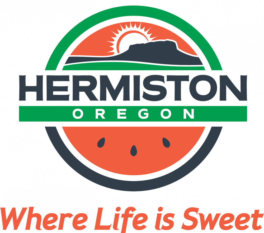
The Where Life is Sweet™ Hermiston community brand started by listening to the community. Through individual interviews and online and printed surveys, the people who live and/or work in and around Hermiston shared their perspectives and opinions about what makes Hermiston distinctive.
In early 2016, community members volunteered to serve on The Hermiston Futures Task Force, Branding and Community Promotion Committee to help develop brand elements to bring the essence of Hermiston to life. Committee members, with the support of Focal Point Marketing & Multimedia and Prominence Public Relations, reviewed the community’s feedback, past committee reports, meeting minutes, and other qualitative and quantitative data before brainstorming together to explore ideas for a Hermiston community brand. The goal was to develop unique brand elements that give Hermiston an identity and unify marketing and outreach efforts with a singular look and voice.
At the end of the development process, two logo designs and two taglines were presented to the community via broad surveys to ensure the committee’s work honored the community’s input and best represented this incredible community. The document linked below provides the directions, ideas, and tools for portraying and unifying the Hermiston community brand. The artwork, colors, examples and specifications provided in that guide will enable users to consistently implement the Hermiston Trademarks in alignment with the brand requirements.